
DENSO Printed Publication
Cover/Back Cover Design Layout
Summary
This is to show important elements constituting the design to deliver the DENSO corporate value correctly and produce the coherent publication design.
Cover
Corporate Mark with a Tag Line
Place the corporate mark with a tag line on the top of the page taking the specified isolation
area into consideration.
D-cross
Use the D-cross for the cover.
Back Cover
Corporate Mark with a Tag Line
Put the following elements on the back cover.
Company name (Company name logo type)
Address
Phone number
An example of the cover design is shown here. Take in the corporate mark/D-cross to produce the cover appropriately according to the rule of Publication Design Basic Design Elements.
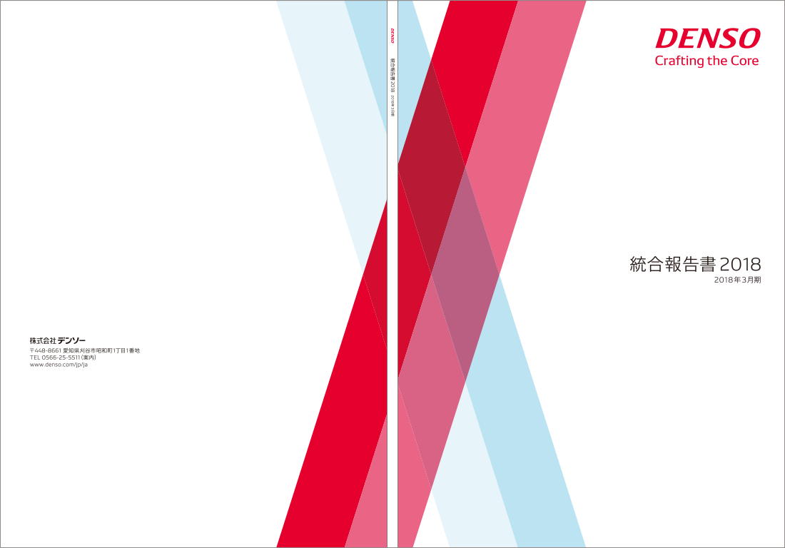
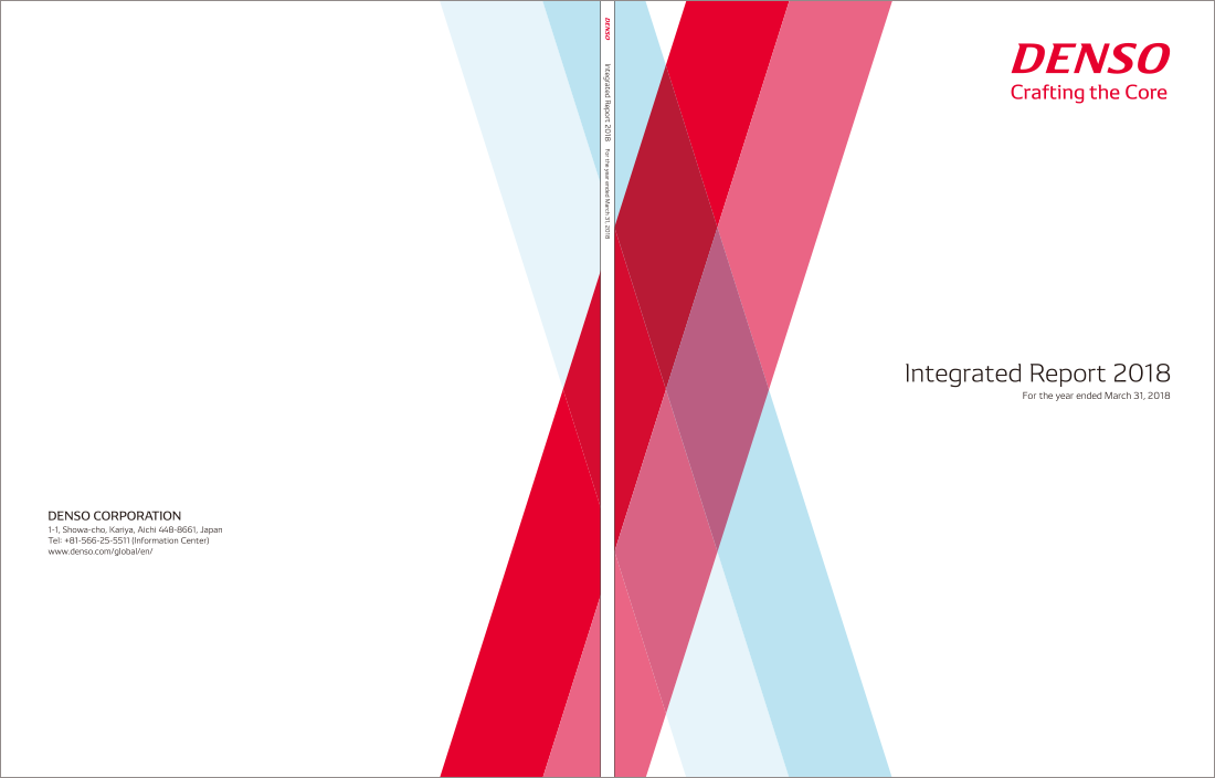
Cover design (US size)
Cover Design (US size)
An example of the cover design is shown here. Take in the corporate mark/D-cross to produce the cover appropriately according to the rules of Publication Design Basic Design Elements.
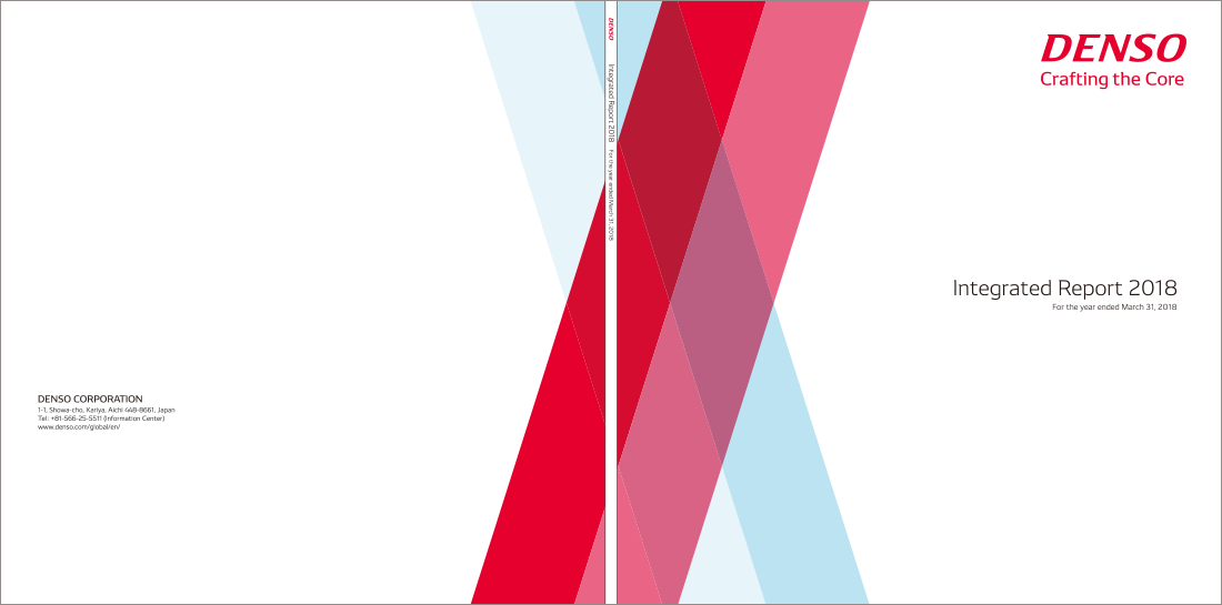
Cover Design (Square)
An example of the cover design is shown here. Take in the corporate mark/D-cross to produce the cover appropriately according to the rules of Publication Design Basic Design Elements.
Cover/Back Cover Design Layout
Summary
Leave enough space to lay out explanatory elements such as textual information and photos. Avoid placing too much. Information on the paper when you design middle pages of publication.Refer to important points on the universal design in 2-04.
Middle Page Design (D-line)
The D-line should only be used when it is relevant and effective. Here's an example of a D-line in a middle-page design. The D-line is used to subtly express the brand identity, either in connection with the tagline or key visual or to break up the paper.For more details on D-line please refer to 1-05-01 and 1-05-02.


Middle Page Design (Typefaces)
Examine the functionality and the readability of the middle page thoroughly to use the typeface effectively. Use colors, weights, and sizes in each information layer so that chapters, titles, subheads, and body text can be easily understood.
Create pages according to the rule of Basic Design Elements
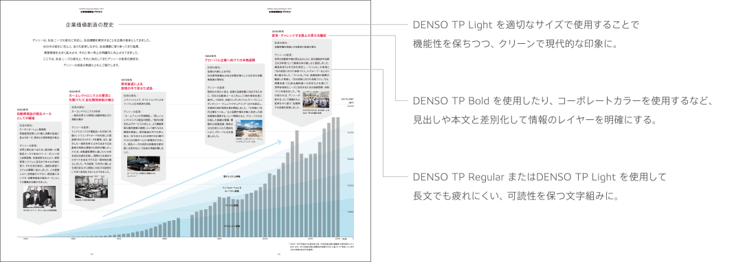
Middle Page Design (Color)
Examine the functionality and the readability of middle pages thoroughly before using the
corporate color effectively. Creatively use colors in each information layer so that chapters, titles, subheads and body text can be easily understood.
The title page shows an example of using the corporate color palette.


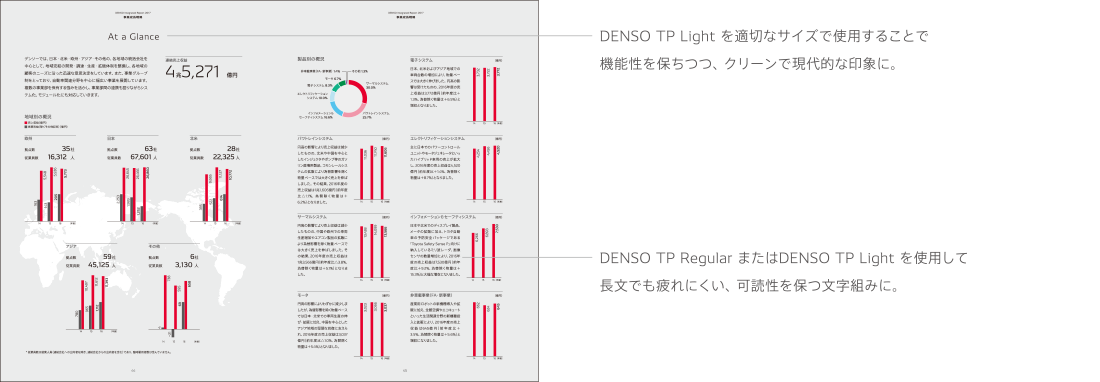
Middle Page Design (Graphs and Tables)
An example of chart tables used in middle page design is shown here. DENSO Red and primary colors are used in a circle chart that shows a parallel relation. Tabular composition helps you to change the line type and broaden the border of adjacent items. Produce the cover according to the rule of Publication design Basic Design Elements.


Examples of Donʼts
Examples of donʼts in the cover/middle page design are shown here. Take account of donʼts and produce publication to correctly and effectively deliver the DENSO brand image.
-
-

Do not make heavy use of D-lines for decoration. Do not make heavy use of DENSO Red for decoration.
-
-
-

Do not trim photos in the D-cross pattern.
-
-
-

Do not constitute the D-cross in a triangle shape.
-
Universal Design
It is important to take account of the universal design when designing publication in order to equally deliver information to all stakeholders. Produce publication by referencing to important points on the universal design described right.
Layout
Leaving a certain space in a page layout contributes to readability. Be sure to keep 30% or more space for margins on the entire paper.
Line Spacing
Line spacing is an important element to determine readability of publication. Set linefeed to 175% of the font size and ensure at least 150% for Japanese. Ensure at least 120% of the font size for linefeed of English.
Chart/Tables
Use simple and plain expressions. Emphasize important parts and show values in a clear manner. Design PDFs with the consideration of printing with a monochrome printer for publication.
Color Scheme
There are many different types of visual characteristics in individuals. Cataract sufferers and elderly people with impaired vision have difficulty distinguishing the difference between low-light colors (especially blues). Additionally, colorblind individuals have difficulty distinguishing between red, green, and blue colors. When choosing colors to be used in text and graphics, please take into consideration the visual characteristics of the user.
Reference for color vision deficiency.
Visual performance varies greatly from one individual to another and may differ from the actual image.
-
-

General visual performance of individuals with color deficient vision
-
-
-

Cataract visual performance
-
-
-

Partial color blindness visual performance
-
The following color vision universal design support software allows you to simulate the visual performance of colors of each color vision type and check for color schemes that are difficult to distinguish.
UDing(Japanese)
http://www.toyoink1050plus.com/tools/uding/
Copyright © 2014 TOYO INK CO.,LTD.
Environmental Friendliness
DENSO promotes environmental practice in various business situations. It is important to always have environment-friendly viewpoint for publication produced by our group based on this principle. Refer to the following environmental considerations when creating a publication.
Paper
Various types of environment-friendly papers are available. Select the most appropriate paper in each country and district. We recommend that you use environment-friendly papers especially for CSR reports that include environmental practice reports.
General environment-friendly papers and features (reference example: Japan)
- Forest certified paper: Raw material is wood sourced from certified forests.
- Recycled paper: This is produced by recycling used paper.
- Non-wood paper: Raw material is non-wood pulp (kenaf and bagasse).
- Timber Paper from forest thinning: Raw material is wood such as timber from forest thinning and edge materials.
Paper manufacturing companies give various considerations to the environmental load by reducing CO2 emissions derived from fossil fuels used in the manufacturing process and adding chemicals such as bleaching and coating. Judge the environmental features and characteristics in a comprehensive manner and use the paper corresponding to the environment-friendliness as much as possible.
What is forest certification?
- FCS certification (Forest Stewardship Council)
- PEFC forest certification (Programme for the Endorsement of Forest Certification Schemes)

These are international organizations to certificate forests properly and sustainably managed in the point of the global environment conservation.
The logo mark is given to the wood of forests and products certified by these organizations.
Printing/Processing

Select an appropriate ink from various environment-friendly inks (soybean oil ink, recycled vegetable-oil-based ink, VOC free ink, and UV ink). Introduce excellent methods in the environment-friendly viewpoint including printing method supporting environment-friendliness and bookbinding and processing methods to facilitate recycling.